Nicole Designs Data
map marker
Rehoboth Beach, DE
📊 Data visualization engineer + consultant 💻 Founder, Women in Dataviz
Book a 30-minute chat with me
🆕✍🏼 How to ADHD with AI: Meeting Notes
🆕📊 How much can you expect to earn as a R.N. in the U.S. in 2025?
📝 Does data matter in the age of vibes?
Join Women in Dataviz!
Tableau Public profile
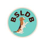
🆕🗃️Breed-Specific Legislation (BSL) Database (U.S.) - Bans by Municipality